Home » Content Marketing » How to Create the Perfect CTA for Your Brand’s Facebook Posts

How to Create the Perfect CTA for Your Brand’s Facebook Posts
You see them every single day.
Facebook posts from countless brands trying to grab attention and prompt some action.
You can’t scroll down for two minutes without seeing a call-to-action.
And for good reason.
There are over 80 million business pages, including 7 million ‘active advertisers’. And all of them are trying to reach as many of Facebook’s 2.45 billion monthly users as possible. 86% of U.S. marketers advertise on the biggest social network.
Marketing experts understand the importance of using Facebook to drive conversions.
And they also know the power of CTAs buttons, which can increase click-through-rates by 2.85 times.
As a marketer, you can’t be left behind, and you’re probably already using Facebook to promote a brand.
But how exactly can you make the most out of your Facebook CTAs? How can you create the perfect Facebook CTA for your brand?
When you’re trying to push a brand on the biggest social network, every part of your post is important. It’s not just about using CTA buttons to get a conversion.
No, there are four components of your post to carefully consider.
Captivate With Your Visuals
The first, and most obvious, part for any marketing expert is the image you use in your post.
Because you just have to use images. Most Facebook posts nowadays have images with them that make users stop scrolling.
Everyone does it, not just marketers. Look at memes and gifs for example. You use them when you want to accurately express a feeling or a message to your friends. These visuals are more captivating than simple text and they evoke reactions.
When running your brand’s page, you can use visuals that stand out from the norm.
Make them stop scrolling and contemplate your post in amazement or curiosity.
Use images that’ll make them say, “Wait, what?” Images of things they’re not used to seeing.
Be different, but don’t overdo it too much. Otherwise, you risk your audience expecting unorthodox images.
Another way to captivate is to use a bright image in your post. Lighter visuals are more noticeable than darker ones.
You can keep things simple by using a clear image with a bright, high-contrast color.
And make sure that the image you choose conveys exactly what you’re offering. This way your audience understands immediately what your post is about. If you’re using words in your image, they need to be clear and concise.
Once you’ve got the right image, it’s time to think about the other parts of your post.
Intrigue With Your Headline
It’s not enough to have a great image to your post if your headline isn’t going to pique your audience’s attention.
You could have the most amazing image ever, but then your headline doesn’t convey anything. Sure, you might get Facebook users to stop scrolling for a moment, but they won’t click on your post. You haven’t really given them any reason to.
Your headline should make your audience curious enough to want to click. It should make them go, “This seems interesting. I never thought of this (this way). Huh?”
It can be:
- Thought-provoking
- Funny
- Personal
- Controversial
- A question
- An opinion
The headline you use is how you choose to present your post. It’s the main reason people choose to click through. The words you use here are important and they have to be compelling.
“When you have written your headline, you have spent eighty cents out of your dollar.”
— David Ogilvy, founder of Ogilvy & Mather, known as the “Father of Advertising”
They need to shock and excite, not bore your audience. They’re probably scrolling through their timeline because they’re already bored. Prompt them to act!
Magnetic headlines have to be:
- Unique: Your offer has to be compelling and exceptional
- Useful: Your post has to relate to your audience’s wants and needs
- Ultra-specific: Leave your audience in no doubt about what your post addresses
- Urgent: Your audience should want to click on your post immediately
And don’t write long headlines. Your audience is likely to lose interest if you don’t keep them short. This is social media after all, where attention spans are reduced.
Inform With Your Description
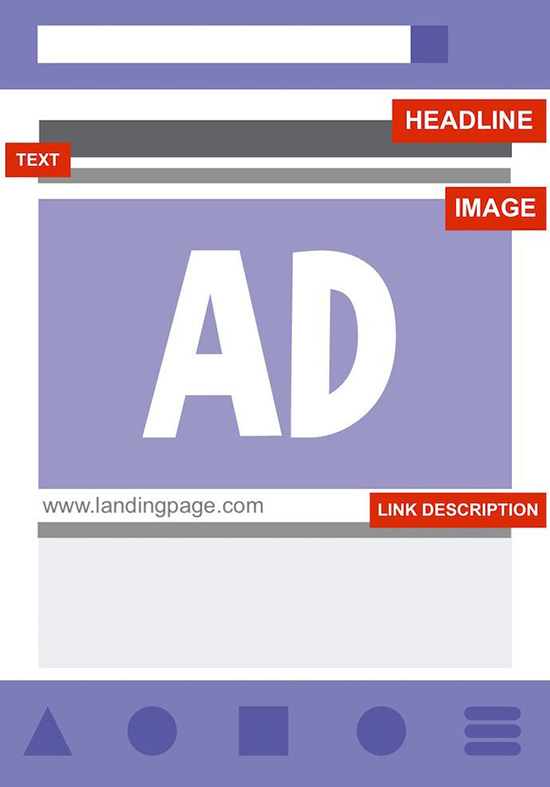
To fully convince your audience to click, you need a killer description that gives more detail about your post.
The description is the part below your headline which provides an excerpt or summary.

Source: blog.hubspot.com
Your image makes your audience stop scrolling, and your headline makes them curious. But your description gives them just enough information to fully grab their attention. It builds on the headline while leaving them wanting more.
Keep your description brief and yet clearly expressed, with the same tone as your headline. Most descriptions don’t go over 15 words according to Smart Insights.
Don’t give it all away before your audience has had a chance to click.
You can:
- Describe the post in a few words and leave them hanging with words like “Click to read more”
- Keep it simple, listing the added benefits your audience will get from clicking
You also have to consider that most Facebook users prefer using mobile devices. 96% of users according to Oberto to be exact.
So it’s best if your description fits well into the space provided on smartphones and tablets.
Convince With Your Status
At this point, you’ve got the right image, the attractive headline, and the brief description. Great, most of your audience will click and you’ll get incredible conversion-rates.
But there’s one final piece to the puzzle that you need to consider. One that’s last on the list of key elements but certainly not least important: your status.
You might be thinking, “This part’s easy, I’ll just…:
- Add the post’s title in my status.”
Or
- Share the post as it is without a status.”
You’d be wrong to do any of these two options, so don’t.
None of them engage, and they both seem dull or forced like your page is sharing for sharing’s sake.
This is your chance to really be creative and say what you want about the post. It needs to be exciting and include an ask. Meaning you should request something from your audience.
This can be a link to your content or a question that introduces it. You want to keep your status short, ideally less than 40 characters and definitely less than 80.
For the obvious reason that you don’t want to tire your audience before they’ve read your post.
Learn to Create More Content For Your Social Media
You now have all the information you need to create killer CTAs for your Facebook posts. Brilliant!
But you could be doing so much more with your marketing and drastically increase conversions. You can guarantee organic traffic to your site from social media by buying content. And it’s so simple, you’ll wonder why you have done it before.
If this article has got you excited about amping up your brand’s Facebook page, but you still feel like a rooky. Consider investing in yourself and trying an online marketing course and learn the basics of eCommerce blogging.
CopySmiths
I'm Katrina McKinnon, founder of CopySmiths and Small Revolution. In my 20 years of experience, I have helped online businesses create high-performing content specifically on an eCommerce store's blog. Find me on LinkedIn and Twitter.

CopySmiths offers the best blog writing services for online stores.
If you'd like us to write blog articles for you, click here.
Most Recent
- 3 Bold Questions You Should Ask When Hiring A Content Writer

- 5 Practical Reasons You Should Use a Blog Post Template

- 4 Amazing Benefits of Using a Title Generator for New eCommerce Blogs

- 10 Awesome Bio Examples Your Online Store Blog Should Emulate

- 8 Basic Steps to Successful Content Development Every Time

Podcasts
Got a question?
Ask our friendly team about our article writing services.
Subscribe to CopyZine
Monthly, hand-picked stories of the best in eCommerce Content.


