Home » Blog » How to Create Effective CTAs for Your Brand’s Facebook Posts
How to Create Effective CTAs for Your Brand’s Facebook Posts
The future of business is digital.
Brands understand that millions of their customers spend a lot of time online.
The number of active users on social media currently sits at 2.3 billion. Facebook remains the preferred platform with 2.5 billion active users per month to date.
Every 60 seconds, 293,000 new status updates and 510,000 comments are posted on Facebook.
Why does this matter to brands using social media?
74% of Facebook users are high-income earners. This makes them a prime target of 7 million advertisers and over 80 million business pages. Each of these brands is looking to connect with consumers.
For brands, social media is not about posting content to a crowded newsfeed. It is not about hoping for the best outcome.
Potential customers still need convincing. No matter the industry or the platform.
Businesses are implementing strategies that tune in to online social behaviors. In so doing, they achieve simple but lucrative business outcomes.
These include:
- Improving brand awareness
- Increasing website traffic
- Finding organic leads
- Increasing sales
- Generating customer loyalty and goodwill.
All the above outcomes begin with creating an effective call-to-action.
CTA’s motivate people into a form of interaction with your shared content.
They may choose to:
- Click on a button that leads to a landing page of your choice.
- Sign up for a promotion, newsletter, or competition.
- Like, share, and comment on your post.
A great CTA can increase your post’s click-through-rate by as much as 2.85%.
Ready to capitalize on your Facebook social capital? Here are five simple strategies to guide you on how to write high converting CTAs.
1: Master the Art of the Headline
The primary goal of a headline, in any type of content, is to get someone interested enough to click on it.
In most cases, headlines account for almost 50% of your post’s effectiveness. But, a person will only click on a headline that connects to them specifically.
This means that you need to understand who your target audience is.
“ If you use a poor headline, it does not matter how hard you labor over your copy because your copy will not be read.” – John Caples
The best type of headline lets users know what to expect of the content even before they click. It has to provide an immediate benefit.
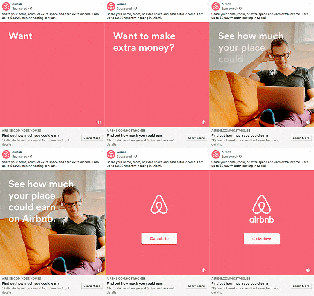
Avoid vague headlines. Consider the below example from Airbnb:
Source: medium.com
There are many degrees of personalization in the advert. Likely, you instantly noticed the value proposition from AirBnB’s well-crafted headline.
It is short and to the point. It answers the question about what the reader stands to gain – money. Even better, it offers a tool to explain how the reader will make more money and how much.
High converting headlines are:
- Unique
- Useful
- Urgent
- Specific
Your headline should relate to your customer’s needs and interests.
It should achieve this goal using very few characters. Most importantly, it should set you apart from your competitors.
Always think about how to inspire readers to take immediate action.
2: Inspire Engagement Using Creative Visuals
There is always value in using aesthetics online.
BuzzSumo’s research shows the power of captivating images. They can get you at least 2.3 times more engagement than text posts on Facebook.
The right images evoke emotion, curiosity, surprise, delight, trust, connection, amusement, concern, or genuine interest.
When these feelings are paired with a CTA Button, you have a winning solution.
Popular streaming service Netflix nailed it with a simple CTA: Join Free for a Month.
But have a look at the image accompanying the above CTA in the below ad:

Screenshot from: Netflix
They reassure customers with a free trial subscription. They also chose an advert that perfectly symbolizes the idyllic family life.
Both CTAs used in the ad match Netflix’s primary logo colors. Not once do these elements distract from the intended emotion of the image.
Always select brand visuals that will stand out from the newsfeed.
Well-selected visuals make users pause, even for a second to check out your post. Your headline should finish the job for you.
Bright imagery and high-contrast colors are neat tricks to learn as well. They make your posts more noticeable than darker or more cluttered images.
Remember to keep it simple.
The images have to compliment the message in your post. They cannot take over or confuse your audience.
3: Set the Tone With Your Status Update
As a brand, you need to master the skill of writing status updates. They should be creative, engaging and interesting
You want to keep your copy subtle and to the point.
Always use a minimum of 40 characters and don’t go beyond 80.
In the end, remember that you are reaching out to an audience on social media. People steer clear of brands that oversell or those with excessive business jargon.
A generic status will annoy your targeted readers. It will also get lost in the Facebook algorithm. This means no one will even see the post anyway.
The secret to writing a gripping status update is in finding balance.

Think about making it easier for your readers. Write a status that shows the human side of your brand.
Always aim for a professional, but approachable tone.
Here’s an example of a consumer-focused status update from Dove:
Using the hashtag #Beautyis, Dove taps into a youthful demographic. The words they use in the status update make it all about the users.
Selfies are addictive. This post invites a high volume of organic engagement and traffic. There’s no cold hard selling involved.
The key to a well-written status update is to get people to take on your agenda as their own.
4: Get Creative With Link Descriptions
The post description lies under the post headline. It could also be text preceding a shared link.
The main thing to remember with Facebook posts and accompanying descriptions is brevity.
The images you choose make your audience pause from scrolling. The post headline instills a little curiosity.
The description closes the deal.
It shares the right amount of extra information to make them feel like they need to know more.
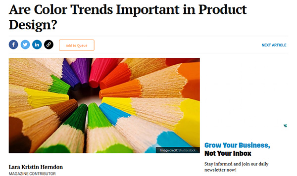
Entrepreneur did it best with the example below:
Screenshot from: entrepreneur.com
In both the headline, image choice, and post description, you know exactly what’s in store for you with this post.
The text in your descriptions should stay below 15 words.
They also need to maintain the essence of both theme and tone found in your headline.
96% of people on Facebook use mobile devices. This is another reason to keep descriptions as short and as enticing as possible. You don’t want any hanging text.
Write post descriptions in a way that draws people in but does not give away too much information.
Elevate Your Digital Brand Positioning
As a brand, you should make an effort to form and maintain genuine online connections.
Remember that the best kind of CTA evokes a sense of urgency.
Your target reader should feel compelled to respond as fast as possible.
Consider the simple tips shared in this article. Go the extra mile by investing in an online marketing course. A well-organized course will help you master the basics of e-commerce blogging.
CopySmiths
I'm Katrina McKinnon, founder of CopySmiths and Small Revolution. In my 20 years of experience, I have helped online businesses create high-performing content specifically on an eCommerce store's blog. Find me on LinkedIn and Twitter.

CopySmiths offers the best blog writing services for online stores.
If you'd like us to write blog articles for you, click here.
Most Recent
- 3 Bold Questions You Should Ask When Hiring A Content Writer

- 5 Practical Reasons You Should Use a Blog Post Template

- 4 Amazing Benefits of Using a Title Generator for New eCommerce Blogs

- 10 Awesome Bio Examples Your Online Store Blog Should Emulate

- 8 Basic Steps to Successful Content Development Every Time

Podcasts
Got a question?
Ask our friendly team about our article writing services.
Subscribe to CopyZine
Monthly, hand-picked stories of the best in eCommerce Content.


