Home » Blog » Perfect CTA Position: Power Up Your Blog
Perfect CTA Position: Power Up Your Blog
Your call-to-action (CTA) is the most important part of your blog. There’s no question about that.
It’s the very reason you create content in the first place. It’s why you spend hours writing and researching topics for your blog.
You create content because you have something to offer your target audience. And so your blog content gets you noticed. It brings traffic to your website and provides information.
And within your blog is where readers find your call-to-action. It’s an incentive that prompts them to act urgently and follow your instructions.
Your CTA is the first step in converting curious readers into real customers. It appears in the form of a link or button to click on.
If your blog content is the fishing rod allowing you to reach into the lake, your CTA is the bait that attracts the fish. With a little skill on your part, they’ll latch onto the hook that represents the service you’re offering. Resulting in a successful conversion.
However, content creation and thoughtful CTAs should involve a lot less deception than the process of catching fish. It’s important to remember that your content and CTA should remain honest and relevant to your readers.
Having CTAs on your blog is crucial. And it’s just as crucial to know where to place them for maximum results. You want to know where they’ll have the likeliest chances of getting clicked.
Here you’ll learn about the 5 most powerful sections of your blog where you can put your calls-to-action. You’ll find out about the most compelling areas to place your CTAs and then you can decide which will work the best for your site.
Static CTAs at the Top of the Page
The top of the page is the most obvious area where CTAs on most blogs are placed.
The CTA appears in the form of a bar that sticks to the top of the screen as you scroll down the content. This placement is ideal because the CTA remains in the reader’s sight the entire time.
Persistent CTAs usually have a simple prompt asking your audience to:
- Subscribe to a newsletter
- Learn about a new announcement or offer
- Try out a service for free
- Claim a free gift
- Contact the business
- Enroll in a course
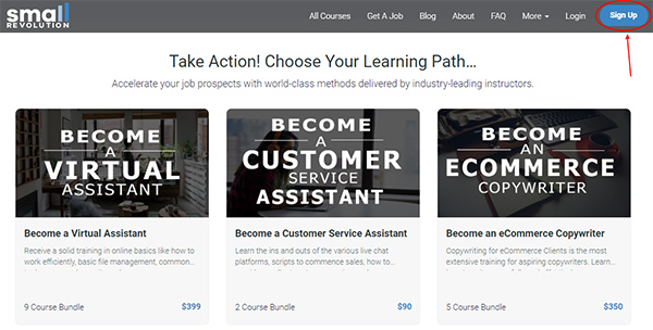
Screenshot from Small Revolution
These static CTAs are ideal because they:
- Are the first things blog visitors see when they land on your page
- Grab attention instantly in an age when most audiences lose interest the more they read
- Don’t distract the reader from the main content on your blog; your audience can keep reading, understanding, and scrolling down the article
- Remain constant and easy to reach when readers are ready to act
The HelloBar website is an excellent tool you can use if you’re looking to add a persistent header to your blog. It’s free and simple to use and, guess what, it shows a great example of this particular CTA placement.
The only downside of header CTAs is that they don’t have much room for you to get creative with your prompts.
Sidebar CTAs
The sidebar is another smart section where you can include your CTAs. You can use this space for:
- Ads about your products or services
- Simple forms for readers to fill
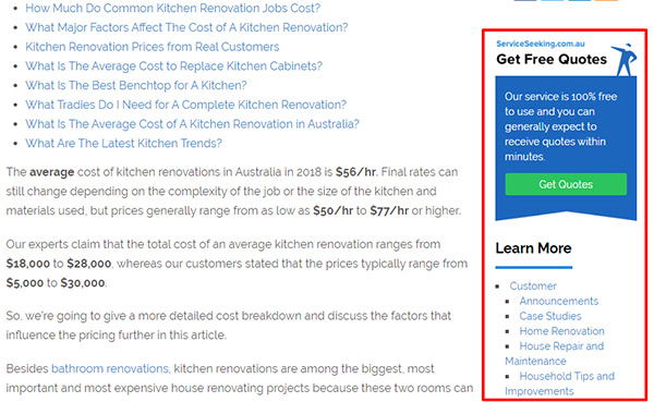
Screenshot from Service Seeking AU
When including ads here, it’s best to promote your own offerings instead of paid ads for other businesses. You want to keep the entire page relevant to what your business or brand is all about.
Paid ads give the impression that you’re desperate for cash and ruin the audience’s experience. Whereas having your own offers right next to your content is incredibly appealing.
When displaying capture forms in your sidebar, keep it short and sweet. Ask your readers to subscribe to your newsletters with a simple email submission.
You don’t want to take too much focus away from the blog article. That’s the reason they landed on your page in the first place.
Sidebar CTAs are great because they:
- Allow you to get creative with visuals for your ads
- Remain relevant to the topics you’re addressing in the article
- Are easy to find, immediately beside your content
- Aren’t obtrusive for your readers
Above-the-Fold CTAs
These are often capture-forms asking readers for their details and they’re found in the main body. Above-the-fold refers to the top half of your blog. It’s visible to your audience without scrolling.
The negative aspect of using this placement is that some readers may find it annoying.
Most people don’t want to land on a page and then scroll to find the article. And your audience might decide to scroll down to read your content but then forget about this CTA.
Yet, there’s no denying the potential benefits of using an above-the-fold CTA. This placement:
- Instantly grabs attention, increasing the chances of conversion if the CTA is clear
- Provides relevant information about your site
- Allows you to explain your business in greater detail, letting people know what to expect
- Creates a straightforward path to conversion

Screenshot from World Manager
Different readers experience your content on different devices (laptops, tablets, and phones). You need to remember to customize these CTAs to suit the different platforms.
Key to your business’ success is your ability to diversify your blog articles. The Small Revolution School teaches you exactly how to create different content.
Popup and Slider CTAs
These two types of CTAs aren’t restricted to one section of the page. They appear once a certain action is prompted or a stage is reached. This can be:
- Once the reader reaches the end of the content
- At the halfway point of the article
- As the reader finishes scrolling to the footer of the page
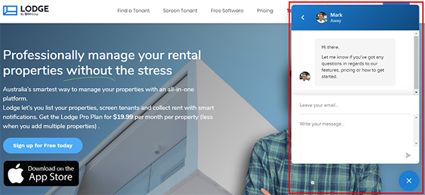
Screenshot from Lodge
The most common slider CTAs offer a direct messaging option to customer service. This enables the business to assist readers with any queries they may have.
In return for help, some sliders request email addresses for future communication.
Popup CTAs are more effective when they appear after the reader has finished the article. They’re a final reminder for your audience to act before they leave your blog.
If done right, CTAs that show up out of nowhere can be:
- Captivating and visually intriguing because of how they appear on your screen
- Appealing to interact with because of the services they provide
- Detailed with relevant content your audience appreciates
In-Line CTAs
When writing blog articles, it’s important to include CTAs in your content. In-line CTAs are links that appear in the text. They’re different from visually compelling buttons.
You can place in-line CTAs throughout the article, but it’s crucial that you end your content with one. The final call-to-action is the main one in your entire piece.
It’s the solution your audience has gone through this reading journey for. It’s your selling point.
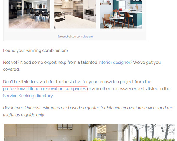
Screenshot from Service Seeking AU
The big CTA will link to other articles with related information on a topic or a sale.
You’ve written a whole article about a specific topic, now it’s time to tell readers what they need to do next. Sell the benefits of following through.
Great blog content is useless to your business if it doesn’t have a compelling in-line CTA to go with it.
In-line CTAs are essential because they:
- Constitute part of the main body so it’s more than likely readers will notice them
- Rely on the rest of the article to provide compelling reasons to click
- Showcase expertise and relevance on the issue
- Appear as the most logical next step for readers to take
Whichever placement you choose for your CTAs, it’s important that you use a combination of arrangements. Use eye-catching CTAs as well as your in-line CTAs.
This increases your chances of conversion by giving your audience many different prompts.
CopySmiths
I'm Katrina McKinnon, founder of CopySmiths and Small Revolution. In my 20 years of experience, I have helped online businesses create high-performing content specifically on an eCommerce store's blog. Find me on LinkedIn and Twitter.

CopySmiths offers the best blog writing services for online stores.
If you'd like us to write blog articles for you, click here.
Most Recent
- 3 Bold Questions You Should Ask When Hiring A Content Writer

- 5 Practical Reasons You Should Use a Blog Post Template

- 4 Amazing Benefits of Using a Title Generator for New eCommerce Blogs

- 10 Awesome Bio Examples Your Online Store Blog Should Emulate

- 8 Basic Steps to Successful Content Development Every Time

Podcasts
Got a question?
Ask our friendly team about our article writing services.
Subscribe to CopyZine
Monthly, hand-picked stories of the best in eCommerce Content.


