Home » Content Marketing » How to Enhance Your CTA Buttons for Outstanding Results

How to Enhance Your CTA Buttons for Outstanding Results
A call-to-action is a prompt for readers to click on your blog or business website. It tells your audience exactly what they need to do as they absorb your content.
There are many different types of CTAs, which come in all shapes and sizes, but one thing is clear:
Every business with an online presence needs CTAs.
CTAs are the key to achieving your website’s goals. Clicking them is the first step your readers take in the conversion process.
Once you have your call-to-action, you need to make sure that people will want to click it.
You need to enhance it.
There are different ways to augment your CTAs. Here’s how.
Use High-Contrast Colors
To get more clicks, your CTA buttons need to grab attention. Your readers need to notice them and think, This looks interesting.
Capturing your site visitors’ attention is the first key to getting them to click.
Your CTA button should make them react like Dee Dee in Dexter’s Laboratory: “Ooh, what does this button do?”
And one of the best ways to do that is through the use of colors that pop. Because, after all, why is Dee Dee attracted towards the button? Its Bright. Red. Color.
Bright colors that contrast with the rest of the content on your page are very obvious to your readers. It leaves them with no doubt that this is what you want them to click on. This is the action you want them to take next.
So take a careful look at your blog or website and analyze its colors. Look at the colors of your:
- Background
- Article content
- Headlines
- Images
And then select a different color that captivates. But make sure that the shade you choose doesn’t clash with your site’s color scheme. Using the ButtonOptimizer website is a smart way to find out which colors will work best for you.
Increase Prominence Within the Blog Article
When it comes to CTA buttons, size matters. Your readers will notice your CTAs better if they’re larger than the rest of your blog content.
So you don’t want your CTA to be too small to notice, but you don’t want it overly large and distracting either.
Your content is the first reason your readers landed on your page so the CTA shouldn’t take away from it. You want your readers to feel intrigued but not overwhelmed.
You want your CTAs to feature prominently within the article.
As you create content, it’s important to diversify your formats. You want to write different types of articles that advertise your offerings. There’s no better way to learn about content formats than through this Small Revolution course.
It teaches what you need to know about eCommerce Blog Content Formats.
Use Whitespace to Your Advantage
Your blog or business site is likely to have plenty of blank spaces, also known as whitespace. It’s the area between the paragraphs in your articles or your visual elements (images and videos). Make the most of the whitespace you have by displaying your CTAs there.
CTAs, no matter the size or design, can stand out when surrounded by enough whitespace. They’re clear to see and readers can tell they’re CTAs because they’re not displayed like your other content.
You can also do the opposite and cut the whitespace between your CTA and other eye-catching items. If an image attracts a lot of attention, you can take advantage of that by sticking a CTA nearby.
You can use any whitespace you have. Don’t limit yourself to placing a CTA at the end of your blog. Many readers don’t even make it to the end of an article.
Use Pill Buttons for Clicks
There’s something about pill buttons that’s more appealing than rectangular ones. Pill buttons are the ones with those rounded edges. They’re more alluring than the boring and traditional square buttons.
Pill-shaped buttons look more like actual buttons. And square-shaped buttons look more like ads than clickable prompts.
It’s also a smart idea to use a font that’s different from your main content. Unique fonts help your CTAs to stand out better in your pill-shaped buttons. But remember that the CTA fonts you choose need to complement the content fonts well.
And keep your CTAs in these buttons short with up to two words ideally. You can use other elements around the pill buttons to provide more information.
Short and simple prompts that work well in pill buttons include:
- Sign up
- Try free
- Buy now
- Learn more
- Submit
- Call now
Perfectly Position CTAs
Where you place your CTAs is equally important as how you design them. Displaying more than one in different areas and designs increases your conversions. You need to know which sections of your site work best for you.
There are five strong CTA-conversion areas where you should try putting your prompts. These include:
At the top of the page
CTAs here are displayed across a static bar that remains visible as readers scroll down. The placement is great because it’s the first thing your audience notices and the CTAs aren’t obtrusive.
In the sidebar
This placement is ideal for your ads and easy-to-fill capture forms. You should use this area because it allows you to incorporate visual items and CTAs are easy to find here.
Sliders and popups
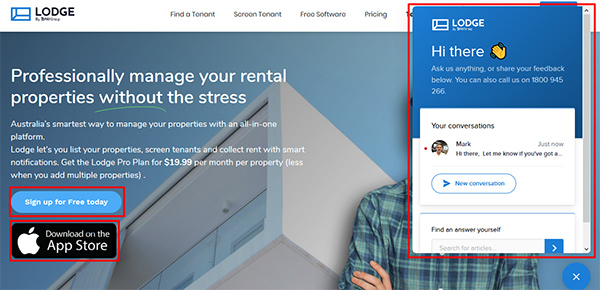
The way these CTAs appear out of nowhere is intriguing to readers. They can appear when prompted, halfway through the article, or at the end of the article. Popups and sliders are usually displayed as reminders to act before leaving the site or ways to contact the business.
Above the fold
CTAs in this section are found at the top of the page without the need to scroll down. They’re prominent and captivating from the start. They can also provide relevant information about your business.
In-line
These CTAs are included in the article. They’re necessary for all blog content because your audience will encounter them as they read. There should always be an in-line CTA at the end of your article as well as throughout the content.

Screenshot from Lodge
Test CTA Effectiveness for a Winning Formula
With so many different options available to enhance your buttons, it’s important to test them. You need to find exactly which combination works best for your site.
Try different things out with A/B testing and you won’t have to guess what works. You’ll have the data to prove what’s most effective. A/B testing allows you to test different variations of your CTAs by dividing your audience.
Meaning one segment of your audience sees a different CTA than the other segment(s). You then test the conversion success rate for each CTA version and pick the one that performs best.
When using the A/B testing method, remember to:
- Set an original (or ‘control’) version of your CTA to compare with the edited one(s).
- Choose only one variable to change for each test.
- Run your CTA variations at the same time for better accuracy.
- Select your sample audiences at random to avoid bias.
You’ll find that the smallest changes to your CTA buttons can make a big difference.
CopySmiths
I'm Katrina McKinnon, founder of CopySmiths and Small Revolution. In my 20 years of experience, I have helped online businesses create high-performing content specifically on an eCommerce store's blog. Find me on LinkedIn and Twitter.

CopySmiths offers the best blog writing services for online stores.
If you'd like us to write blog articles for you, click here.
Most Recent
- 3 Bold Questions You Should Ask When Hiring A Content Writer

- 5 Practical Reasons You Should Use a Blog Post Template

- 4 Amazing Benefits of Using a Title Generator for New eCommerce Blogs

- 10 Awesome Bio Examples Your Online Store Blog Should Emulate

- 8 Basic Steps to Successful Content Development Every Time

Podcasts
Got a question?
Ask our friendly team about our article writing services.
Subscribe to CopyZine
Monthly, hand-picked stories of the best in eCommerce Content.


